DISCLOSURE: This post may contain affiliate links, meaning I get a commission if you decide to make a purchase through my links, at no cost to you. Please read my disclosure for more info.
As a business owner marketing on Pinterest, images are top of mind when it comes to content marketing. But what about infographics? How can you engage your audience and improve business performance using a Pinterest infographic? Simple, incorporate these three types of infographics into your content to provide the most impact for your customers!
Table of Contents
Comparison Infographic
Comparison infographics can be a great way to get your customers engaged with your content and really think about your business offerings. The possibilities with comparison infographics are endless. Depending on the tone of your business, you can choose what types of comparisons will speak to your audience the most.
Some companies like to compare themselves to their competitors in some way to show that they have an edge in the industry. This may include anything from comparing products or services to comparing sustainability in the production and logistics sector of the business.
Other companies focus on comparing different product options in a broad sense such as organic vs non-organic foods. A medical company may use a Pinterest infographic to illustrate the difference between habits and how they impact your health. Similarly, a company in the business sector may compare the productivity of employees in certain situations.
Data Infographic
Data infographics are used to inform your customers of something. This could be anything that is supported by hard data. These infographics allow your customers to digest important information quickly and effectively.
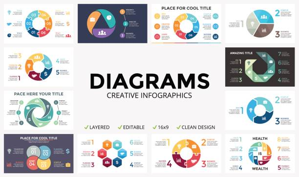
There are many different types of infographics that focus on data that can be beneficial to incorporate into your business Pinterest page. In general, data can be presented in any type of graph format such as bar graphs, pyramids, pie charts, or any other visual diagram. Alternatively, data can be presented in an engaging layout that mimics a printed flyer or even laid out like a timeline.
The format of the infographic should be relevant to the data you are presenting. For example, if you are presenting annual business metrics, it wouldn’t make sense to present it in a timeline. However, an engaging layout that highlights the metrics could be perfect!
Flowchart Infographic
Finally, consider working with flowchart infographics to communicate processes to your customers. This may include anything from organizational charts to supply chain and sustainability to explaining recipes! Again, the possibilities are endless.
A flowchart engages the audience through a dynamic graphic that guides the visual through a process to communicate an idea to the customer. In general, a flowchart should have a beginning that connects somehow to the end. Designs can be vertical or horizontal as long as they create a connection between the steps to the process.
With these three types of infographics in mind, you are ready to take on Pinterest marketing. Bring your business to life with digital design elements that will speak to your customers and inform your marketing strategy today!
