DISCLOSURE: This post may contain affiliate links, meaning I get a commission if you decide to make a purchase through my links, at no cost to you. Please read my disclosure for more info.
I am going to make a bold statement here: Pinterest color seo can affect your rankings in search too!!!
Table of Contents
How Does Pinterest Color SEO Usage Affect Conversions?
When we think about search engine optimization (SEO), our minds usually go straight to Google. But here’s the thing: Pinterest acts as a search engine, too. You type in a query, and it returns results.
So, just like with Google, we can optimize pins and boards for keywords and other factors that help them show up in searches… and another element can affect how easily Pinterest content is discovered and interacted with Color!
In this post, I am going to walk you through exploring the psychology of color in your Pinterest designs and how thoughtful color choices can influence your Pinterest Color SEO and conversion rates.
Stay with me, because this is NOT your typical blog post. I have videos, step-by-steps and more because I truly BELIEVE in this Pinterest Color SEO theory of mine.
Learn how optimizing color can transform your small business presence on Pinterest.
The Power of Color
Humanity has been fascinated with color for thousands of years. From cave paintings to the stained glass of ancient cathedrals all the way to today’s digital designs, color profoundly impacts art, culture, emotions, and visual communication.
And it’s not just in the worlds of art and web design where color holds power. The colors we surround ourselves with influence our daily lives and even our subconscious decision-making.
Notice how specific car colors tend to cost more or how the paint color of a room can affect how we feel when we walk in. Our color choices impact how we show up in the world and how the world responds back.
To learn more in-depth about each color psychology – turn to my friend Michelle Lewis of The Color Cure Blog.
“Whether you’re creating a new blog, sending out email campaigns, updating social posts or investing in new ad strategies, understanding the science of how colors evoke specific feelings in consumers can give you a competitive edge in terms of engagement, conversions and sales.“
Read more here: The Power of Color Psychology In Marketing: How to Harness The Science and Emotional Impact Of Color

Color Psychology in Pinterest Color SEO
After breaking down the basics, how does color tie in with Pinterest SEO? Here we go. At its core, color psychology examines how different shades influence human perception, decision-making, and actions on a subconscious level.
Studies have shown colors can play with our emotions, change our behaviors, and even impact physiological factors like appetite.
In the social media context, color psychology means leveraging the effects of visual hues to accomplish SEO goals.
We can use color strategically to:
- Attract users’ attention
- Boost engagement and click-through rates
- Build brand recognition and trust
- Create a sense of urgency or excitement
- Elicit desired emotional responses
- Guide users towards target actions
Of course, color associations stem from cultural and personal contexts. For instance, red signifies love and passion in Western cultures. Yet, it symbolizes luck and prosperity in Chinese culture. Your audience and backgrounds inform what shades inspire or dissuade.
But human sight perception does lend itself to some universal tendencies. Contrast grabs attention, while complementary colors please the eyes and mind.
Strategic color usage indirectly boosts SEO by delighting users, building engagement, and sculpting reactions.
Does Color Psychology Matter for Pinterest Color SEO?
Now, you might be wondering — does color really influence ranking algorithms? Can Pinterest’s systems actually analyze an image and go, “Hmmm… nice blue hue!”?
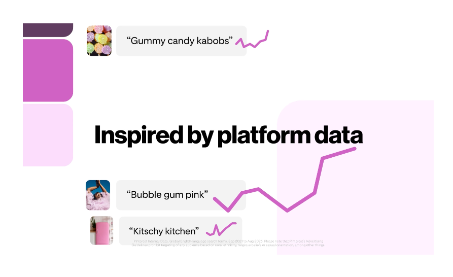
Well, in February 2024 Pinterest announced they will be Introducing the Pinterest Palette: A custom color set to inspire your creative.

Each year, we publish Pinterest Predicts, a roundup of 20+ up-and-coming trend predictions pulled from platform data. And this year, we curated a custom color palette inspired by these emerging trends.
The best part: We’ll will refresh this color palette each year, on the heels of our annual trend report launch. Take advantage of the trending colors to inform your creative assets, your product assortments and your seasonal color palettes.
Pinterest pulled out the most persistent hues from the trending keywords (and will continue to each year). On top of that they did a deep dive into the cultural zeitgeist.
SO YES!
Pinterest can “search” color and Pinterest color seo should be apart of your strategy.
The indirect effect of Pinterest Color SEO
While Pinterest can’t detect what shades you use, color can indirectly inform user behavior. Certain shades elicit specific emotional and psychological responses. They motivate users to click, save, share, or take other actions at higher rates. So, while color itself may not improve SEO, its effects do.
Increased user engagement signals to Pinterest algorithms that the content resonates. Result? A relevance boost that lifts search engine rankings and discovery potential.
For example, pins leveraging the color red’s sense of urgency and excitement may garner higher click-through and repin rates. That trains Pinterest’s search engine to surface those pins more prominently.


Several studies support color’s indirect influence. For instance, up to 92.6% of first impressions tie to color schemes.
The technical effect of Pinterest Color SEO
On a technical front, skillful use of visuals, especially color contrast, helps construct a visual hierarchy in pins. This allows Pinterest users to quickly parse different elements based on their visual weight and meaning. If a pin has a clear focal point, formatted text, and purposeful color flow, it becomes easy to comprehend at a glance.
This frictionless visual communication keeps visitors engaged instead of bouncing away confused. It improves the user experience. In turn, Pinterest sees signals of effective content, keeping eyeballs locked in, and can surface those pins more prominently in search and feeds.
In short, color choices influence visual clarity and scannability. Less friction and faster comprehension, thanks to strategic color, indirectly inform rankings.
The cultural effect of Pinterest color SEO
Finally, color preferences stem from cultural and regional contexts. Especially in shades with more nuanced meaning vs primary colors. For example, Pinterest users in Greece, Israel, or the Mediterranean may visually connect more with white and blue color schemes typical in those regions.
Or a Football town like Pittsburgh, with a deeply connected fan base to the black and yellow colors of their team logo, may also prefer visual content with similar color schemes.
If your content features culturally relevant colors, it may garner higher engagement from users who feel an inherent affinity. Over time, increased interactions again signal relevance to Pinterest for improved SEO.
What Is My Pinterest Color SEO Theory?
If you are not seeing the results you want when trying to rank your pins, and you THINK you have tried everything possible but you just still can’t get your pins in the top 10… look no further.
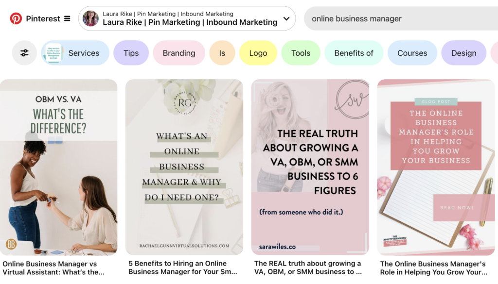
The way I research this is I will go to Pinterest and use the search bar for the keyword I want to rank for.
For example, let’s use “online business manager” for the keyword we will be looking at. Even just looking at the top 4-5 pins we can notice similar colors across them.

How to Complete Your Pinterest SEO Color pin designs
Intrigued by the color wheel framework for Pinterest but not sure how to construct your own? Follow this step-by-step guide to implement strategic color SEO efforts:
Identify Core Colors [VIDEO]
First, analyze your keyword phrase on Pinterest to select 3-5 pins you most want to rank and drive traffic among. These will form the core of your wheel for your new test pin.
Assign Colors
Choose which colors go along with your brand, stand among the top pins, and then choose how to call out the keyword on your design with the new Pinterest SEO colors you discovered.
Test and Analyze
Use Pinterest Analytics to monitor performance by color segments. Review which hues and topics attract the most engagement and visits back to site pages. Refine poorly performing areas and double down on what’s working per the data.
You can see below the different colors and styles that still are branded for our client but also closely align with the “online business manager” keyword research we did above. Even just looking at the top 4-5 pins we can notice similar colors across them and the ones we designed below.

How Do You Prevent Font Color From Affecting Pinterest SEO?
We’ve covered how strategic use of color can work magic. You can add a dash of color to your pins in many forms. From a boxed background to a colored font, you know which colors to use.
But what about slip-ups that repel users through poor color combos? Let’s review standard font and color pitfalls and how to avoid negative impacts and maintain a positive user experience:
Use contrasting colors for text and background.
To ensure text legibility, web design experts stick to high-contrast color combos, placing dark fonts on light backgrounds or vice-versa. Hard-to-read text frustrates users, risking bounce rates, which directly lower rankings. Instead, opt for combos like:
- Black/dark font on white/light background
- White/light font on black/dark background
- Dark font on a muted red background
- Light font on a navy blue background
Aim for enough contrast between text and background for easy scanning without eye strain.
Consider the psychology of colors in your branding and design.
Combine symbolism and meaning using strategic colors that attract your niche while also boosting legibility. For example, an orange social media CTA on white conveys friendly urgency, while white text overlays cleanly. Don’t undermine excellent copy with poor color associations or visibility struggles.
Avoid Sensory Overload
Too many colors risk confusing users instead of dazzling them. Stick to a primary color scheme with neutral accents and pops of color for focal points. Changing colors arbitrarily distracts without purpose.
Spatial organization also matters — contained color zones feel cohesive instead of disjointed. Keep edits intentional, consistent, and orderly.
Follow other font best practices.
Beyond just contrast and color psychology, additional font and typography choices impact engagement.
- Use appropriately sized text for comfortable reading without squinting on smaller screens.
- Limit font varieties for cohesion without overwhelming readers.
- Use strategic formatting like bold fonts or italicized text to emphasize critical points minus overkill.
- Review full typography guidelines to polish pins with high-converting text.
Utilize color hierarchy in your pins.
Finally, the principles of the Color Wheel Theory we’ll explore next also involve using color variation to establish hierarchy, draw attention to crucial elements, and communicate nuances. Mastering color across the visual journey boosts comprehension while engaging users based on psychological tendencies.
Paint Your Way to Success With Pinterest Color SEO
That’s it! You’re ready to give it a whirl. Optimizing a visually-driven platform like Pinterest means getting creative with color. Take inspiration from basic color psychology to build boards and pins that speak to users on multiple levels.
What colors resonate most with your brand identity and audience? What emotional responses do you aim to elicit? Brainstorm creative ways color can make your profile pop while conveying purpose. The canvas awaits your most pintastic masterpieces!
If you need more support taking your Pinterest presence from blah to brilliant, check out my Pinterest coaching program or done-for-you Pinterest optimization services on my website. I’m here to sprinkle a little color magic and watch your brand thrive one pin at a time!
