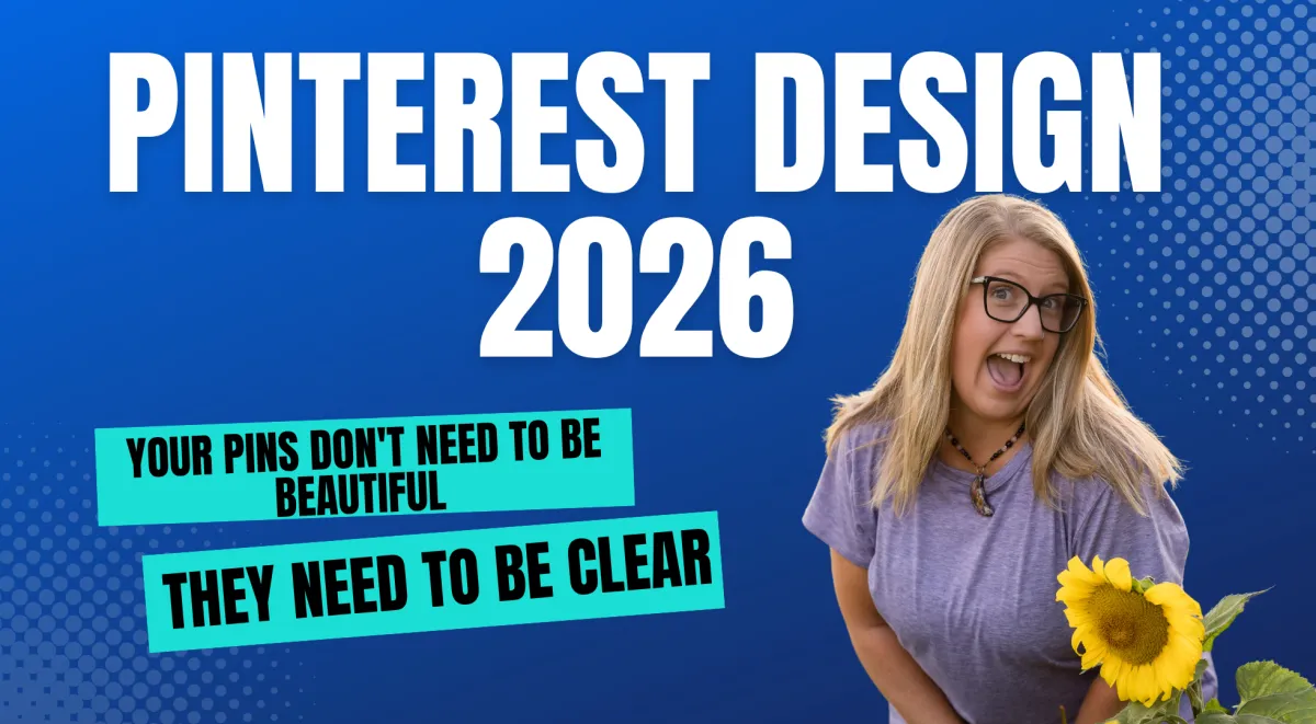
Pin Design 2026: You Don't Need to Be a Designer First
Pin Design 2026: You Don't Need to Be a Designer First
If you have been sitting on Pinterest because you think you need to be a designer first, I need you to hear this.
One of the most common things I hear from people is: I'm not creating enough. I don't have a visual brand. My pins look so amateur.
Here's what I say to that.
The platform that is sending your future clients to you does not care if your pin has a gorgeous gradient or a perfectly curated color palette. It cares if it answers the search.
Pin Design 2026: You Don't Need to Be a Designer First
Pin Design 2026: You Don't Need to Be a Designer First
Four Things Your Pin Actually Needs
The Story Everyone Tells
There is a story circulating that goes like this: Pinterest is a visual platform. Therefore, you need to be a visual person with a visual brand to succeed on it.
I get where that comes from. Pinterest looks beautiful. When you scroll the home feed, you see lush photography and polished layouts and fonts that look like they were designed by a team in Brooklyn.
So it's easy to think, I need to match that energy before I even start.
Here's the truth though. That's not what the algorithm is evaluating.
Pinterest is a search engine. At its core it's matching search intent to content. A user types something into the search bar, and Pinterest's job is to surface the most relevant, trustworthy, and useful result.
Your pin design plays a role. But it's a supporting cast member. The keyword, the description, the board it's on, the landing page it connects to are doing the heavy lifting.
The pin just needs to do one job: get the click.
The Coffee Shop Menu
I walked into a coffee shop and there was this gorgeous hand-lettered chalkboard menu on the wall. Botanical drawings. Perfect spacing. A work of art.
But the problem was I couldn't read a single item on it. The contrast was low. Everything was the same size.
I spent a full two minutes squinting before I just pointed at something and said, "I'll have that. Just make sure there's caramel in it."
Then I turned around and on the counter there was a plain laminated sheet. Black text on white paper. Large font. Category headers in bold. Price next to every item.
I literally ordered two more things off that sheet.
The beautiful menu didn't make the sale. The readable one did.
And that is pin design. Your pin doesn't need to be art. It needs to be clear, readable, clickable.
Clarity converts. Beauty is optional.
Four Things Your Pin Actually Needs
Readable text. The number one design mistake I see on Pinterest is text that's too small. Your font choice doesn't have to be fancy. It has to be legible at a glance. Bold sans-serif fonts work. Clean, high-contrast text on a simple background works. The test: if you squint at your pin and you can't read the headline, your viewer can't either.
A headline that matches the search. The words you put on your pin are keyword signals. Your ideal client is searching "email marketing for coaches" and your pin headline says "Level Up Your List"? You have a mismatch. Put the actual search language directly on the pin. This is why text-based pins are so powerful. They're essentially keyword-rich headlines in visual form.
A simple background that does not compete with the text. You don't need a professional photo shoot. A solid color background, a subtle texture, a clean stock photo with plenty of negative space all work. What doesn't work is a busy background that makes the text hard to read. The background's job is to hold the text, not to perform.
Consistent branding, not perfect branding. You don't need a luxury brand identity. People aren't searching for a specific brand. They're searching for a specific solution. You just need to be consistent. Same two or three colors. Same one or two fonts. That consistency builds pattern recognition over time.
Text-Based Pins Are Underestimated
A text-based pin leads with text, not imagery. Think tip-based headlines, question-led prompts. Clean, direct, readable.
Here's why they work so well: the person searching Pinterest is in problem-solving mode. They're not browsing passively. They typed in something because they need an answer.
A text-based pin that speaks directly to that search intent functions almost like a search result headline. It says, "Yeah, this is exactly what you're looking for."
You don't need to be a designer to create these. You need a design tool like Canva and a headline that matches how your audience is searching. That's it.
The Right Sequence
I see a lot of people spend weeks perfecting their aesthetic before they've done the foundational strategy work.
Design is tangible. It's something you can see and control and tweak. But it's the wrong place to start.
The sequence that works: First, nail your keyword strategy. What is your audience actually searching for? Second, build the right board structure. Pinterest needs to understand what category your content belongs to. Third, align your pin descriptions, board descriptions, and landing pages so there's cohesion across the whole system. Then design the pins that reflect all of that strategy.
Design is a multiplier of strategy, not a replacement for it.
And if today's episode made you realize that the design piece is actually the easy part, and what you're really missing is the strategy underneath it (the keyword research, the board structure, the system that makes Pinterest compound over time), that's exactly what we build inside Pin Hacking Academy. It's a four-month live cohort program where we build out your entire Pinterest strategy from foundation to scaling with coaching, community, and a course library to support you every step of the way.
Final Pin Drop
Your pins don't need to be beautiful. They need to be clear, keyword-matched, and consistent. That's it.
Design is not the barrier you think it is. Strategy is the foundation. Design just carries it.
📌 Learn more about Pin Hacking Academy → laurarike.com/academy